|
|
Post by jeffwaynefan on Mar 26, 2005 13:00:51 GMT
So far we have 2 posters from Pendragons 'H G Wells' The War Of The Wolrds'. The first shows the narrator on the dog cart with horse as a leg of a machine in the foreground. The second shows the lifeless eyes of the Martian - but what would you have choosen for these posters.
I would have liked to have seen a day shot image of Weybridge/Shepperton with just the 3 legs of the machine showing moving about the wrecked and burning buildings. This would give a sense of mystery to the remainder of the machine as in the foreground we could have people fleeing from its approach.
H_C
|
|
|
|
Post by Lucius909 on Mar 26, 2005 13:10:45 GMT
I rather like the eyes - I know it's CG but it looks pretty creepy and effective to me, and is probably the best option if Hines is going down the eploitation / horror route, which it seems he is.
In which case, naked people in martian electro space bondage may bring in even more of a "specialist" audience.
Lucius
|
|
|
|
Post by Rob on Mar 26, 2005 13:23:54 GMT
I'd have a beautiful shot of London in the evening foreground big bens clock face, mid ground london as in 1898 sprawling towards the horison. Red sky at night and a green line just about to impact the ground about 20 miles away.
yet the image seems so calm and still. Then there could be another poster with the same view but all destroyed with a tripod in the mid ground, the sky red and red weed spread across the country. This poster would come out at the same time as the other.
|
|
|
|
Post by themotile on Mar 26, 2005 13:30:07 GMT
I'd have a beautiful shot of London in the evening foreground big bens clock face, mid ground london as in 1898 sprawling towards the horison. Red sky at night and a green line just about to impact the ground about 20 miles away. yet the image seems so calm and still. Then there could be another poster with the same view but all destroyed with a tripod in the mid ground, the sky red and red weed spread across the country. This poster would come out at the same time as the other. Actualy that would be an instant gimmick and fan boys would just have to have the two, man PP missed out on so much they could have cashed in on with this. |
|
|
|
Post by jeffwaynefan on Mar 26, 2005 16:14:11 GMT
'fan boys' - sounds like a 90s boy band.
|
|
|
|
Post by Thunder Child on Mar 26, 2005 18:41:55 GMT
I really like the new poster.
Maybe they should make a poster with a picture of the exodus on it. Tired people in dirty clothes pushing each other forward. Wounded soldiers, injured dying people lying on the side of the road with nobody to help them. With big words: The rout of civilisation.
Johan
|
|
|
|
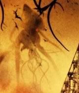
Post by Tripod on Mar 26, 2005 20:11:59 GMT
Great computer animation of those eyes I have to say! Pendragon is back and better than ever!!!
Tripod
|
|
|
|
Post by TOMAHAWK on Mar 26, 2005 20:28:59 GMT
I would have liked to see this (lot of visualzation needed)
a view towards the coastline ...black/grey skys, rain, fires in the distance, a choppy sea and a quarter/half image of the Thunderchild as seen from a camera halfwaydown say the starboard side of the HULL pointing towards the coastline ( even better if the nameplate Thunderchild could been seen)
(for example ...get a model of a boat ...put it to the side of your head ..ie eyeline level, with your eyeline in the middle of the HULL, ie between the deck and the keel then move the boat back so you can only see about a quarter of the boat from your eyelevel ...thats the effect i mean.
Anybody know what I am on about ..I do ;D ;D
.
|
|
|
|
Post by Thunder Child on Mar 26, 2005 23:22:12 GMT
Just a comment about the latest Pendragon poster. I showed it to my girlfriend, who isn't into The War of the Worlds like me. But she looked at it and said: "Wow, those are scary eyes. So cold and emotionless..."
The poster works.
johan
|
|
|
|
Post by jeffwaynefan on Mar 26, 2005 23:29:56 GMT
I did the same thing with the missus, but she replied 'oh, self portrait'  |
|
|
|
Post by Thunder Child on Mar 26, 2005 23:39:54 GMT
;D ;D
|
|
|
|
Post by Lensman on Mar 27, 2005 1:41:34 GMT
It might be possible to do a "better" poster using multiple images, but as far as a poster with a single image, I think the current one is the best possible. Using that classic "regarded this earth with envious eyes" line is great, and of course the alien eyes really drive home the point!
Frankly, I don't see how to do a more effective poster without revealing FX images that are better kept secret until the film comes out.
|
|
|
|
Post by Lensman on Mar 27, 2005 4:02:36 GMT
Well alright, let me try to come up with something else. This makes the 9/11 parallel very obvious:
"The year is 1901. Great Britain is the world's sole superpower. The British are confident in their mastery over all creation, and Great Britain has never been invaded by a foreign power.
Until now..."
Picture to show a ruined part of London, paniced refugees in the foreground, and something gigantic, dimly seen in silhouette, striding over the buildings...
~~~~~~~~~~~~~
I dunno. That would be a more evisceral poster, but not necessarily a "better" one.
|
|
|
|
Post by Marztok on Mar 28, 2005 5:18:11 GMT
I think there are so many ways this could be done. The question is: does this one work ? I wasn't too crazy about the first poster because - taken out of context - it didn't really communicate its message well. I think the new poster does. It's not the way I would have done it but I like what they came up with. I think they wanted to show as little as possible yet get the message across. In that, they succeeded. In another thread, somebody said they thought showing the Martian's eyes WAS giving too much away. But just exactly what can be shown without showing anything having to do with the Martians ? I do like the concept of a devastated London with Martian war machines in the background, but it seems to me that this too would reveal some of the movie. There is no real workaround that. Of course, the first poster does not reveal anything because what is suppose to be the Martian machine leg looks something like a big blur. We only know it's a Martian machine leg because we already read the book ! Now, there's nothing to tell us that this is the actual final poster. But for now, it's the latest. P.S.: I wouldn't want this critter to stare at me like that for too long ! |
|
|
|
Post by epicdream on Mar 28, 2005 12:12:00 GMT
[glow=green,2,300]
It's funny because I don't have much hope for the film, but I like this poster...
IMHO, the "horse & cart" poster was rubbish because it really didn't say much about the film, if it was perhaps a close-up of the narrator's eyes, full of fear with either a bead of sweat or blood coming down, that could work (and would tie in with the new poster).
This new poster, however, is along the right lines, creepy. I don't care if it is CGI'd plastic, rubber whatever as long as it gets the point across which, in this case, I think it does. The eyes are cold and emotionless and it is at a jaunty angle to suggest that it is studying us, nice.
The best posters are the ones that show not much but suggest everything, that's the hook.
[/glow]
|
|
|
|
Post by jeffwaynefan on Mar 28, 2005 19:06:53 GMT
They could have used an image of Tony Blair. . . . That would give the impression of disaster, doom & gloom, world domination.
|
|
|
|
Post by McTodd on Mar 28, 2005 19:09:13 GMT
They could have used an image of Tony Blair. . . . That would give the impression of disaster, doom & gloom, world domination. It's science fiction, not gothic horror!!! |
|
|
|
Post by jeffwaynefan on Mar 28, 2005 19:13:04 GMT
;D ;D they could replace the Martian eye's with Blairs smile. Then again someone is bound to get confused and think its a poster for a new version of 'Alice In Wonderland'.
|
|
|
|
Post by McTodd on Mar 28, 2005 19:46:28 GMT
;D ;D they could replace the Martian eye's with Blairs smile. Eurgh, I feel ill... Nurse!!! |
|
|
|
Post by HTT on Mar 29, 2005 9:07:45 GMT
[glow=purple,2,300]They'd never get away with it, but there's only one poster that really says WOTW:
Michael Trims "Thunderchild" setup. A bit of the old photoshop jiggery pokery to position the new ship & tripod correctly, and there you have it. The one image that resonates with everyone, and is instantly recognisable.[/glow]
|
|