|
|
Post by themotile on Jan 31, 2005 19:41:22 GMT
To be fair on Pendragon the first teaser poster released by paramount was also rubbish and created quite a fuss with it being Otto's hand and one of the worst tag lines of all time, however it was only bad by design, the pendragon poster lacks good design and more importantly it lacks 'quality'.
|
|
|
|
Post by TOMAHAWK on Jan 31, 2005 20:18:47 GMT
I am fairly sure something else will be forthcoming, as ***SHOCK HORROR***  - I actually agree with Motile on this....jeez I need to sit down ;D ;D ;D It does seemto have a rather strange concept to it, Notice the horse doesn't appear to be panicking too much ....horses don't tend to be calm faced with a heatray welding Martian whos having a rather good day at the office ;D ;D |
|
|
|
Post by themotile on Jan 31, 2005 21:21:37 GMT
I cant quite work out the expression on the narrators face, has he just sat on a drawing pin? Has his wife just dumped him? Has he just eaten a rather bitter grape? Is he about to sneez?
He just doesnt look like hes just laid eyes on a martian fighting machine.
|
|
|
|
Post by flynnsixtysix on Jan 31, 2005 23:32:38 GMT
I cant quite work out the expression on the narrators face, has he just sat on a drawing pin? Has his wife just dumped him? Has he just eaten a rather bitter grape? Is he about to sneez? He just doesnt look like hes just laid eyes on a martian fighting machine. come on people - you got to admit - that's funny! |
|
|
|
Post by TOMAHAWK on Jan 31, 2005 23:42:41 GMT
At least he is showing some emotion ..the horse is there thinking " oh god here we go again, spazzing out on me, taken some more bad sh*t , ... i'll just pretend I haven't heard him...da doo, nice day for a stroll, grass looks nice and green, ooh a martian.. how nice .....
"Oh god NOOO don't you dare vomit over my back or I will kick you in the nads when we get back to the stables
"What are you screaming for you silly sod....No I won't go ..I am avin summat to eat ....oooh look a 4 leaf clover ...make a wish
STOP EFFING SCREAMING MAN ... CHILL FOR EFFIN SAKE
|
|
|
|
Post by Lensman on Feb 3, 2005 11:08:28 GMT
it may have been made to be as cheap as possible to print, if it is to be printed as they have only used 3 colours, red, green and orange (black and white are academic Not so, Motile. The four colors of ink used in printing are black, red, yellow and blue. The poster obviously has black and red on it, and green is made by combining yellow and blue. So it's a 4-color -- or full-color -- poster. Black may not be considered a "color" in terms of the light spectrum, but black ink is a color used in printing, just like inks of the three primary colors. You are correct when you say printing black is cheaper, but that's because the ink itself is cheaper and used more frequently, not because it's "not a real color". I agree the website and this poster are not too great in terms of art design. I am only an amateur graphic artist but every time I look at the website I just itch to be able to redesign it. But I'm still pumped about this movie! |
|
|
|
Post by maniacs on Feb 3, 2005 11:40:40 GMT
I wonder if its the part where the narrator sees the 2nd MARTIAN appear and hes galloping towards it, just before finding the dead landlord.
|
|
|
|
Post by themotile on Feb 3, 2005 12:10:05 GMT
it may have been made to be as cheap as possible to print, if it is to be printed as they have only used 3 colours, red, green and orange (black and white are academic Not so, Motile. The four colors of ink used in printing are black, red, yellow and blue. The poster obviously has black and red on it, and green is made by combining yellow and blue. So it's a 4-color -- or full-color -- poster. Black may not be considered a "color" in terms of the light spectrum, but black ink is a color used in printing, just like inks of the three primary colors. You are correct when you say printing black is cheaper, but that's because the ink itself is cheaper and used more frequently, not because it's "not a real color". I agree the website and this poster are not too great in terms of art design. I am only an amateur graphic artist but every time I look at the website I just itch to be able to redesign it. But I'm still pumped about this movie! If you go to a printers they will ask you how many colours you want to use, how they make up those colours is academic as they charge per colour printed not colour mixed, so PP would have to pay for red, green, black and orange in that order. Black is the cheapest as it has all the waste pigments in it and is the most widely used, therefore its academic as you have to use that anyway but its cheap. I have been an illustrator for ten years now and have had many quotes from printers, the 3 questions asked are how many prints? How many colours? (the more colours the more expensive, thats why the college rag mag is always 2-3 colours - cheap) and Dimensions? its a possible reason why the poster looks so lame but its not an excuse, its still rubbish on many levels. If I were to hand that to a client I dont think I would get another contract from that client. If that popped up at the local cinema would the average joe suddenly want to see the film based on that poster? |
|
|
|
Post by maniacs on Feb 3, 2005 12:14:40 GMT
motile
For once I agree with u. It looks like something from the seventies, just before Graphic Design took it's next step into punk influence*. I expect that from an old hammer house poster.
*forgot the guy who fronted it!!! Im useless!!!
|
|
|
|
Post by themotile on Feb 3, 2005 12:37:23 GMT
As far as I can see two things jump out as being utterly wrong.
(1) The font, its dire and looks like times new roman from microsoft word 2002, its very basic and gives the impression whoever made it coudnt be bothered.
(2) The picture means nothing, it has no dramatic impact, the fact that only the actor gurning like a chimp seems to be the only one doing anything with the horse seemingly asleep give it a mundane feel, with the lack of colour giving it richness the average joe is going to see a green bloke in a green horse drawn carriage, it might has well have BBC written on the bottom.
|
|
|
|
Post by Ashe Raven on Feb 3, 2005 12:49:15 GMT
A did a simple picture once, it was a pencil drawing of a montage of a Martian striking out at the Earth.
I did another one, drawn entirely in ink, of a foor of a figthing machine stamping down in the middle of a street dark street, black smnoke in the backgorun, printed on a red gradient sheet of paper.
It has the striking words "It was the begining of the Rout of Civilisation, the Massacre of Mankind...."
Both got me a good grade in art for overall impact with a simple mediums.
This poster.... needs work I'm afraid.
|
|
|
|
Post by I own a cylinder on Feb 3, 2005 21:08:56 GMT
|
|
|
|
Post by twistedrabbit on Feb 3, 2005 22:06:14 GMT
Oh Wow! Pendragon finally released something cool looking! What? You made those? I can't tell the difference; the quality is at Pendragon's professional level. I'm just kidding (sarcasm)...those aren't that good...mainly because the resolution is really bad. But that tripod leg is a cool idea...wish that could have been our first teaser poster.  |
|
|
|
Post by I own a cylinder on Feb 4, 2005 2:21:40 GMT
Oh Wow! Pendragon finally released something cool looking! What? You made those? I can't tell the difference; the quality is at Pendragon's professional level. I'm just kidding (sarcasm)...those aren't that good...mainly because the resolution is really bad. But that tripod leg is a cool idea...wish that could have been our first teaser poster. Yeah. I was entertaining myself by fiddling around with a few ideas. Personally I agree, they ain't the good quality i can do when i work on them ;D ;D Im still getting use to the true potential of Photoshop. One day i will be a GOD, But at the mo, big egos like mine think they are good for a first shot, lolol |
|
|
|
Post by themotile on Feb 4, 2005 11:10:37 GMT
I would point out in your defence of those images that you did them at home with no money and a limited knowledge of photoshop and you still did better than pendragon! well done! ;D
|
|
|
|
Post by twistedrabbit on Feb 4, 2005 15:55:02 GMT
Lol. Sadly, he's probably right. I haven't seen any effects in Pendragon so far that don't look cut and paste...it annoys me though still...why does Chrome look so good compared to WOTW? I mean the effects are decent and look pretty good, but compared to the pixelated cg renderings of WOTW...I just don't get it...I sincerely still hope they didn't think they were done with those shots.
|
|
|
|
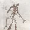
Post by Ashe Raven on Feb 4, 2005 16:50:24 GMT
Her's the image I made years ago  It was drawn interly in ink and I think it was simple but effective for a comic idea. Dunno what you think |
|
|
|
Post by themotile on Feb 4, 2005 17:35:56 GMT
Lol. Sadly, he's probably right. I haven't seen any effects in Pendragon so far that don't look cut and paste...it annoys me though still...why does Chrome look so good compared to WOTW? I mean the effects are decent and look pretty good, but compared to the pixelated cg renderings of WOTW...I just don't get it...I sincerely still hope they didn't think they were done with those shots. They are quoted as saying "Here's the official theatrical trailer, due in theatres this February." If that isnt the theatrical trailer then they are fibbing, but in any case I bet you wont be seeing that "trailer" in any cinema this month. |
|
|
|
Post by themotile on Feb 4, 2005 17:40:49 GMT
Her's the image I made years ago It was drawn interly in ink and I think it was simple but effective for a comic idea. Dunno what you think Its...a bit scribbly, you should have taken more time on the art work but I see the idea behind it, dark brooding shadows, the fighting machine poised over the building giving a feeling of menace. The scribble in the sky kind of detracts from that. Still better than PP's though. |
|
|
|
Post by Ashe Raven on Feb 4, 2005 17:44:15 GMT
It was concept art for acomic that never was
never made the final piece ^^
|
|