|
|
Post by eveofthewar on Dec 14, 2004 7:43:10 GMT
|
|
|
|
Post by EvilNerfherder on Dec 14, 2004 8:15:04 GMT
Very nice indeed, thanks Lee!  |
|
|
|
Post by RustiSwordz on Dec 14, 2004 8:31:35 GMT
That looks like the scene from 'in the storm'
|
|
|
|
Post by the Donal on Dec 14, 2004 12:39:26 GMT
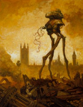
Odd choice of poster for the movie - not a particularly iconic image to entice cinema-goers, though Hines seems always to be aiming only for the fans of the book rather than trying to lure the wider audience in.  Still like it though. Is that a tripod's leg in the foreground....? Or are you just pleased to see me? ;D |
|
|
|
Post by the Donal on Dec 14, 2004 12:46:16 GMT
Also odd that this poster is not on the Pendragon site yet - though this seems to be the last thing updated for anything (ie stills and teaser trailer links). Accepting that Pendragon are busy in post-production, this is often the first portal for any movie and an easy way of advertising......
It could also be down to communication - ie the poster creation was farmed out to someone else and they haven't mailed the final product to Pendragon's webmaster etc....
|
|
|
|
Post by Necronmaniac on Dec 14, 2004 13:05:54 GMT
Well, I was thinking this myself, is it a tripods leg in the foreground? I think it might be personally but i dont know |
|
|
|
Post by jeffwaynefan on Dec 14, 2004 16:19:40 GMT
If it is a leg of a Tripod, it appears to be tubular in design, the lower end of the leg for the foot, and the Narator does not seem to looking up towards the hood (head not cranked back enough). Could be the classic looking from the bottom upwards followed with the words "jeez, thats a big bugger!".
To me its a typical movie poster, a few scenes slotted together as in the story he never came that close on the horse and dogcart to the machine while riding it.
H_C
|
|
|
|
Post by jeffwaynefan on Dec 14, 2004 16:37:34 GMT
"At the turn of the 20th century, visionary writer H.G. Wells conceived of a tale so terrifying that it has captured the imagination of millions of readers for more than 100 years"
And there was me under the impression it was started in 1896 - 19th Century. . . Slight printing error?. As they refer to "conceived", does this mean when the story was written, meaning it would be a printing error after all OR when the story is set.
H_C
|
|
|
|
Post by the Donal on Dec 14, 2004 16:41:28 GMT
Looking closer, it is hard to see exactly where he is looking, but it does seem to be at something further away than the object in the picture.
Zooming in, the edges of that object are feathered (slightly transparent for non-Photoshoppers) indicating that it may, indeed, have been added to the picture. This could be, as you say H_C, a composite of a couple of scenes. Maybe its a developement defect, like in the Omen!
The narrator looks fairly distressed, doesn't he?!
I hope the whole film isn't being tinted green. ;D Like City of th Lost Children- that would be stomach churning in itself...!
|
|
|
|
Post by jeffwaynefan on Dec 14, 2004 16:53:50 GMT
Is it me, or is their another figure standing on the green above the horses butt.
Not wishing to pick faults with the poster but it all looks very "home made" too me, and Hines name under the main title is off center. . . Sorry, being picking.
After all that, I do like it in many ways.
H_C
|
|
|
|
Post by Curate on Dec 14, 2004 22:37:15 GMT
A nice, but odd design IMHO.
The blurred image across the picture seems to be a piece of vegetation, not a tripod leg. Besides, by the time the tripods got that close to the narrator, he was hiding in the grass and his horse was dead from a broken neck. It doesn't appear to be raining in the scene, but perhaps raindrops will be added digitally.
It may be just a publicity picture and not from the final film.
|
|
|
|
Post by RossH on Dec 15, 2004 1:05:46 GMT
Probably just a quick response to the Paramount poster... for the internet only.
|
|
|
|
Post by the Donal on Dec 15, 2004 12:25:06 GMT
There does seem to be a little bit of competition going on with the advance promotion! It's all good for us fans!  It can't hurt the films either.... |
|
|
|
Post by Thunder Child on Dec 15, 2004 18:44:59 GMT
The poster is on the pendragon site right now and it is stated that it is a "teaser" poster. That says it all in my opinion. just a poster to get our mouths wet And on waroftheworldsonline it is stated that the object in front of the picture is indeed a Fighting machine leg. I guess this info comes from Susan Goforth because she is mentioned too. Johan |
|
|
|
Post by Bayne on Dec 15, 2004 23:10:37 GMT
[glow=red,2,300]Wow! This is cool.
I too suspect its a composite shot as I don't think he was near any buildings when he saw the tripod.
The green glow is mostly near the top of the image and thick.. sort of misty. I guess that it is the green gas squirting from the joints of the machine.
I expect that Timothy Hines name has been placed slightly off center to balance the rest of the title logo. Most logos and fonts have criminally poor leading and this arc-of-eye control is a refreshing change. Most designers try and use pure symetry... but humans are not symetrical. It is easier for the eye to move from the upper left to the lower right. Something that needs to be taken into account in all visual media. The strong green contrast of Mr Hines name, set a bit to the left balances out the expansion of the words in red to the right and their colour while pulling the eyes to the lower left once they have made their upper left to lower right journey on the red words and that encourages the eye to move up again to the top of the logo... effectively convincing the eye to circle about the logo comfortably at least twice.
[/glow]
|
|
|
|
Post by FALLINGSTAR on Dec 21, 2004 3:20:47 GMT
Even though I like this poster and I like the design of most of Pendragons logos etc. I'm also concerned that there are parts of this [ and their website ] that do look slightly amateurish. I've studied a bit of graphic design and even though I'm no expert I do take the point about the positioning of the Timothy Hines lettering - and also does anyone else think that the edges of the W and the A in the word WAR should be slanting at the same angle as each other. If you look at Paramounts WAR OF THE WORLDS logo you'll see what I mean. Pendragons just dosen't look right to me. I know this poster is only a teaser and my comments might come across as nitpicking but I really think small[ish] things like this do matter if they want to come across as a professional film studio.
|
|
|
|
Post by Anthony on Jan 30, 2005 22:18:20 GMT
Made a quick little observation and noticed the wotw teaser poster is very much like the kingdom of heaven one. Lol im sad i know.   |
|
|
|
Post by I own a cylinder on Jan 31, 2005 16:29:19 GMT
Hmmm....they are quite similar aren't they. And like some I puzzled over the fact it shows buildings in the background. So I recently checked over the book again. When the narrator meets the fighting machine in the storm, he's approaching Maybury Hill and Woking.
'...At first I regarded little but the road before me, and then abruptly my attention was arrested by something that was moving rapidly down the opposite slope of Maybury Hill.'
So while there is no mention of him being near houses as such, he is just coming into Woking so i always thought there would be some form of dwellings in the vacinity.
Here though it just suggests dramatic license.
|
|
|
|
Post by themotile on Jan 31, 2005 19:01:54 GMT
If you look at it from a costing point of view it may have been made to be as cheap as possible to print, if it is to be printed as they have only used 3 colours, red, green and orange (black and white are academic as they are cheap, you only pay for black which strictly speaking isnt a colour byt rather a shade and is a cheap ink for the printers to use) if you only have 3 base colours it is very cheap to produce as a poster or flyer.
This is all well and good but it does add to the 'cheap' home made look of the poster which wont go down well with the general audience. I wonder did Hines make this himself? It may explain the home made look, he is doing the editing at home after all.
|
|
|
|
Post by I own a cylinder on Jan 31, 2005 19:13:12 GMT
Does it succed as a poster? Personally i think it does but only just. It's not the kind of image i'd use to promote WOTW. Some of the fan art on Eve of the War would be better.
|
|