|
|
Post by mctoddridesagain on Nov 27, 2005 1:20:17 GMT
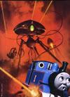
I think he captures the mood of the scenes very well, but the machines themselves look like mid-industrial water towers. Blech.  I think that pretty much says how I feel (which I didn't explain very well earlier) - top marks for mood, could do better for design. |
|
|
|
Post by marciano on Dec 3, 2005 12:01:56 GMT
Well, i like the illustrations, i think that they are quite good....
|
|
|
|
Post by mctoddridesagain on Dec 3, 2005 22:04:28 GMT
Oh, don't get me wrong, I love them, and I'm very happy to have the Castle books reprint and the 'Complete WOTW' which reproduce them and are the next best thing to having the original Pearson's magazines. The mood and some of the compositions he uses are fantastic, but I will concede that the machines could have been a bit more interesting. Their stiff legs do make one understand Wells's complaint ('dutch dolls'), but on the other hand, Goble also deserves top marks as being the first to tackle them - he did a damn good job considering he had no precedent whatsoever. After him, every illustrator of WOTW has had a precedent.
|
|
|
|
Post by Thunder Child on Dec 4, 2005 15:01:26 GMT
Very true. The machine do look interesting, but not realistic.
The mood is very well done and some of the scenery is very well done! I think that Pendragon took the Goble pictures of the Curate and the Writer as inspiration for the movie.
|
|